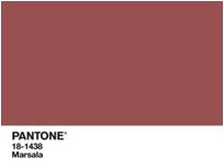
With the announcement of Pantone’s 2018 Color of the Year, our recently updated 2018 Fabric Inspiration Guide, and the brand new fabric options HON introduced this month, it’s clear that we’re excited about color in the workplace this year!
Understanding the psychology of colors and how they influence emotions, it is important to consider the energy you want your office design to convey or the way your brand colors make your employees and customers feel. Blue, for example, incites calmness and serenity. This color might be a good fit for a breakroom or waiting area. Colors like green, orange and yellow that are known to increase happiness might complement open plan spaces and high-productivity environments. Maybe you work for a company that finds importance in wealth and sophistication. If that’s the case, choosing colors like purple and black can give off a sense of authority and prosperity.

Once you’ve selected a color, you then need to decide on patterns and textures. Some patterns are bold, but when paired with a cool, neutral color like gray can become more toned down and harmonious. It’s important to find the right balance of colors, fabrics and finishes to make sure everything feels like it belongs in the space. Looking to show unity in a collaborative work environment? Choosing the same color palette throughout the office might be the way to go. Want to differentiate between departments? Alternate between solid colors and bold prints for each group while using the same base color to help maintain a cohesive look throughout the space. I recommend staying away from overwhelming a space with too many patterns or too many solid colors – usually a nice mix of both will lead to a better result.
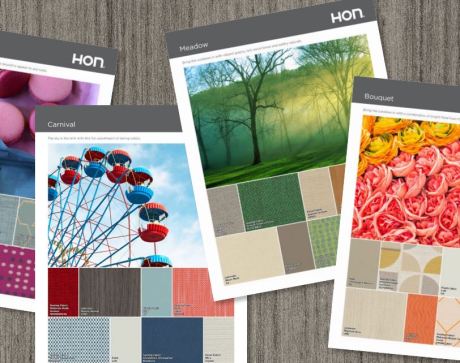
Looking for some color inspiration? Check out our latest fabric introductions and updated color palettes to find the design solutions that will make your workspace a place where your employees can enjoy what they do in a place they love.